We notice that the first variable has no name. We can rename it using the dplyr::rename() function as follows:
temperature <- dplyr::rename(temperature, city = ...1)temperature
# A tibble: 35 × 18
   city  January February March April   May  June  July August September October
   <chr>   <dbl>    <dbl> <dbl> <dbl> <dbl> <dbl> <dbl>  <dbl>     <dbl>   <dbl>
 1 Amst…     2.9      2.5   5.7   8.2  12.5  14.8  17.1   17.1      14.5    11.4
 2 Athe…     9.1      9.7  11.7  15.4  20.1  24.5  27.4   27.2      23.8    19.2
 3 Berl…    -0.2      0.1   4.4   8.2  13.8  16    18.3   18        14.4    10
 4 Brus…     3.3      3.3   6.7   8.9  12.8  15.6  17.8   17.8      15      11.1
 5 Buda…    -1.1      0.8   5.5  11.6  17    20.2  22     21.3      16.9    11.3
 6 Cope…    -0.4     -0.4   1.3   5.8  11.1  15.4  17.1   16.6      13.3     8.8
 7 Dubl…     4.8      5     5.9   7.8  10.4  13.3  15     14.6      12.7     9.7
 8 Elsi…    -5.8     -6.2  -2.7   3.1  10.2  14    17.2   14.9       9.7     5.2
 9 Kiev     -5.9     -5    -0.3   7.4  14.3  17.8  19.4   18.5      13.7     7.5
10 Krak…    -3.7     -2     1.9   7.9  13.2  16.9  18.4   17.6      13.7     8.6
# ℹ 25 more rows
# ℹ 7 more variables: November <dbl>, December <dbl>, Annual <dbl>,
#   Amplitude <dbl>, Latitude <dbl>, Longitude <dbl>, Area <chr>
Data summary
The skimr::skim() function provides a nice summary of the data:
skimr::skim(temperature)
Data summary
Name
temperature
Number of rows
35
Number of columns
18
_______________________
Column type frequency:
character
2
numeric
16
________________________
Group variables
None
Variable type: character
skim_variable
n_missing
complete_rate
min
max
empty
n_unique
whitespace
city
0
1
4
14
0
35
0
Area
0
1
4
5
0
4
0
Variable type: numeric
skim_variable
n_missing
complete_rate
mean
sd
p0
p25
p50
p75
p100
hist
January
0
1
1.35
5.50
-9.3
-1.55
0.2
4.90
10.7
▅▅▇▇▆
February
0
1
2.22
5.50
-7.9
-0.15
1.9
5.80
11.8
▂▂▇▂▃
March
0
1
5.23
4.86
-3.7
1.60
5.4
8.50
14.1
▃▂▇▃▃
April
0
1
9.28
3.81
2.9
7.25
8.9
12.05
16.9
▅▇▆▆▃
May
0
1
13.91
3.27
6.5
12.15
13.8
16.35
20.9
▁▃▇▃▂
June
0
1
17.41
3.32
9.3
15.40
16.9
19.80
24.5
▁▃▇▃▂
July
0
1
19.62
3.57
11.1
17.30
18.9
21.75
27.4
▁▅▇▂▃
August
0
1
18.98
3.73
10.6
16.65
18.3
21.60
27.2
▁▇▇▂▃
September
0
1
15.63
4.11
7.9
13.00
14.8
18.25
24.3
▂▇▇▂▃
October
0
1
11.00
4.32
4.5
8.65
10.2
13.30
19.4
▅▇▆▂▅
November
0
1
6.07
4.57
-1.1
3.20
5.1
7.90
14.9
▆▇▆▂▅
December
0
1
2.88
4.97
-6.0
0.25
1.7
5.40
12.0
▃▇▇▃▅
Annual
0
1
10.27
3.96
4.5
7.75
9.7
12.65
18.2
▅▇▃▁▃
Amplitude
0
1
18.32
4.51
10.2
14.90
18.5
21.45
27.6
▃▇▇▆▃
Latitude
0
1
49.04
7.10
37.2
43.90
50.0
53.35
64.1
▆▅▇▃▃
Longitude
0
1
13.01
9.70
0.0
5.05
10.5
19.30
37.6
▇▇▃▂▂
We learn from it that the data contains 18 variables and 35 observations. The skimr::skim() function also provides a nice summary of the data types and the number of missing values. We can see that the city and Area variables are character vectors and that there are no missing values.
Data visualization
The first 13 columns are the temperature measurements for each month. We can use the dplyr::select() function to select these columns and the city column as identifier:
# A tibble: 420 × 3
   city      month     temperature
   <chr>     <chr>           <dbl>
 1 Amsterdam January           2.9
 2 Amsterdam February          2.5
 3 Amsterdam March             5.7
 4 Amsterdam April             8.2
 5 Amsterdam May              12.5
 6 Amsterdam June             14.8
 7 Amsterdam July             17.1
 8 Amsterdam August           17.1
 9 Amsterdam September        14.5
10 Amsterdam October          11.4
# ℹ 410 more rows
Next, we convert the month column to a proper date-time format using the lubridate::parse_date_time() function:
Now we can plot the temperature measurements for each city using the ggplot2::ggplot() function. We also use the scales::scale_x_datetime() function to format the x-axis labels to only show the month names:
temperature_sub |>ggplot(aes(x = month, y = temperature, group = city)) +geom_line() +scale_x_datetime(labels = scales::date_format("%b")) +theme_bw() +labs(x ="Month", y ="Temperature (°C)", color ="City" ) +theme(legend.position ="none")
It is hard to see from this plot which cities have similar temperature profiles. A principal component analysis (PCA) might help us to find out.
Principal component analysis
It is important that PCA be performed on exclusively numeric variables. Hence, we first need to use dplyr::select() to retain only the columns corresponding to the monthly temperatures:
X <- dplyr::select(temperature, 2:13)
Before performing PCA, it is important to standardize the data. For this purpose, we can use the base::scale() function:
X <-scale(X)
Now, we are going to use FactoMineR::PCA() to perform the PCA and the factoextra package for visualization of the results. When visualizing observations, the package uses the rownames of the input data frame to label the observations. Hence, we anticipate here and affect the city names as rownames of the data set:
rownames(X) <- temperature$city
Now we can perform the PCA using the FactorMineR::PCA() function:
pca_results <- FactoMineR::PCA(X, graph =FALSE)
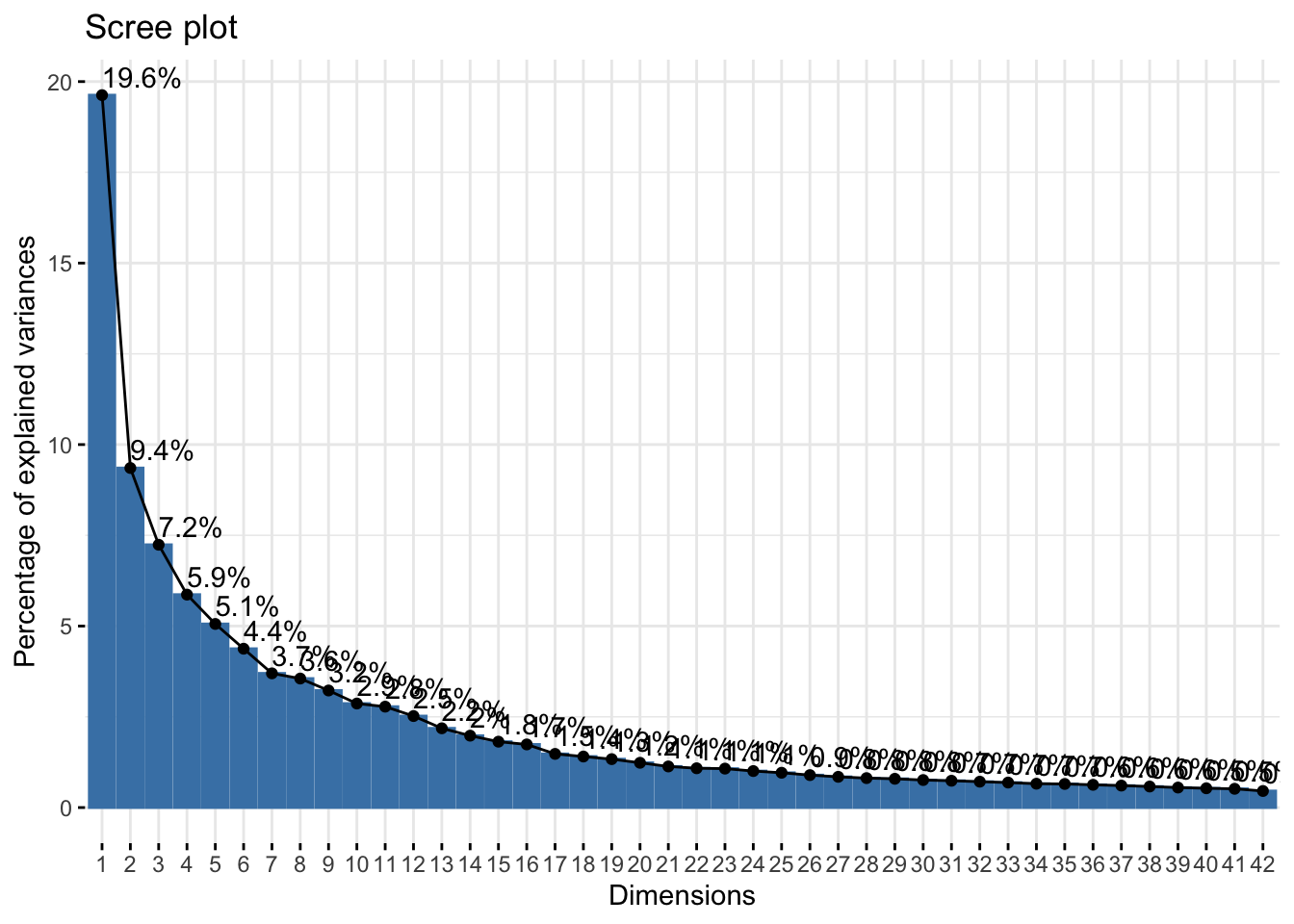
Choice of the reduced dimension
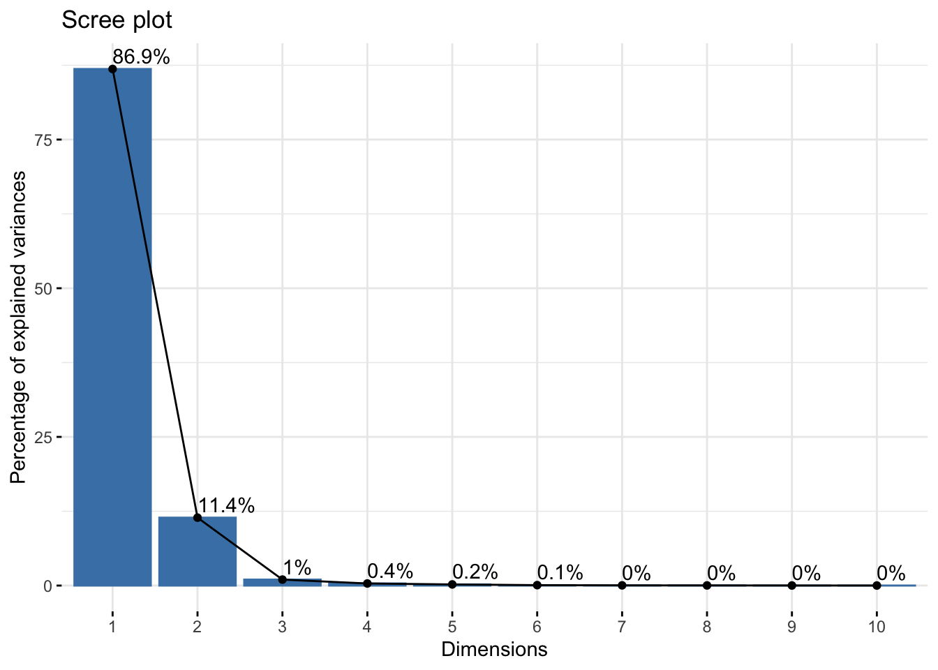
We can also use the factoextra::fviz_screeplot() function to plot the eigenvalues:
This suggests that the first two principal components explain almost all the variance in the data.
Analysis of the variables
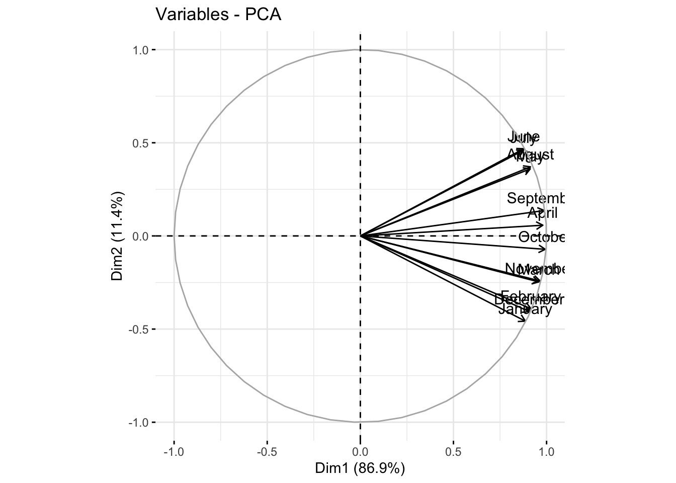
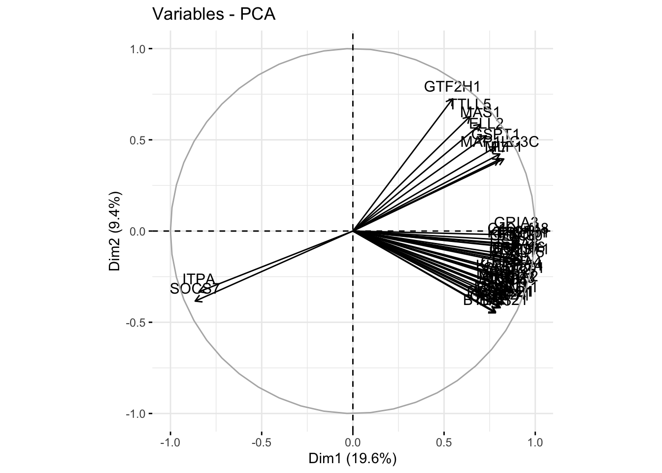
We can use the factoextra::fviz_pca_var() function to visualize the coordinates of the variables in the proposed reduced space consisting of the first two principal directions:
factoextra::fviz_pca_var(pca_results)
We see from the above correlation circle that:
the first principal component seems to produce a rather uniformly weighted average temperature over the year; a high score on this component means a high average temperature over the year.
the second principal component instead contrasts temperatures between the warmest months (summer months) and the coldest months (winter months) hence somehow providing an estimate of the range between maximal and mininal temperature; a high score on this component means an elevated difference between maximal and minimal temperature over the year.
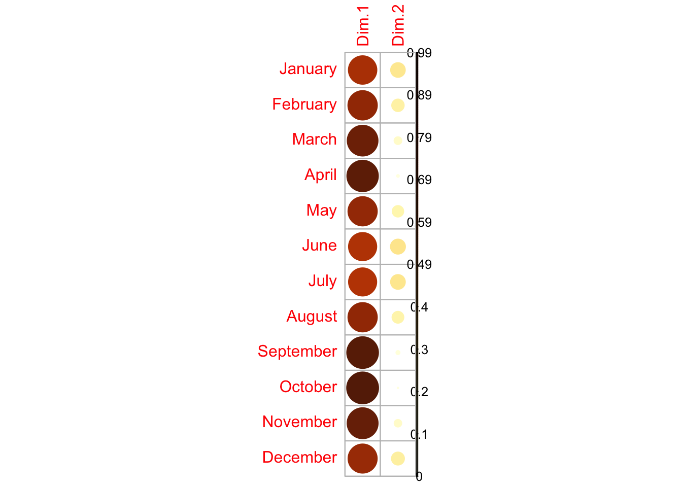
We can assess whether each original variable is well represented by the first two principal components by looking at the cos2 values:
The original variables are indeed well represented. They even would all be well represented by the first component only.
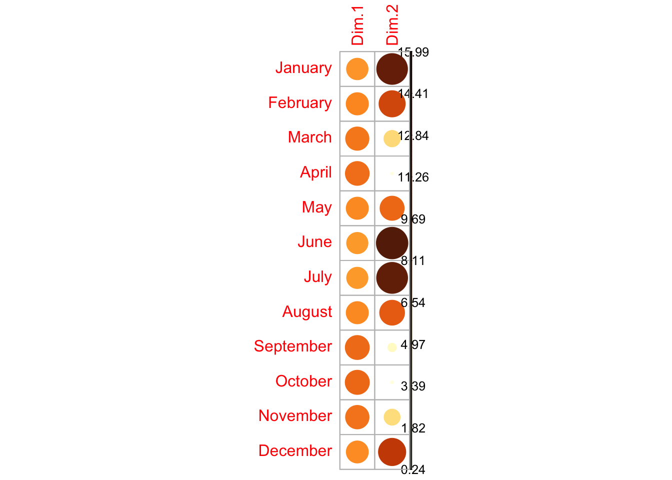
We can confirm the interpretation of the first two principal components that we were able to give from the correlation circle by looking at the contribution of each original variable to the principal components:
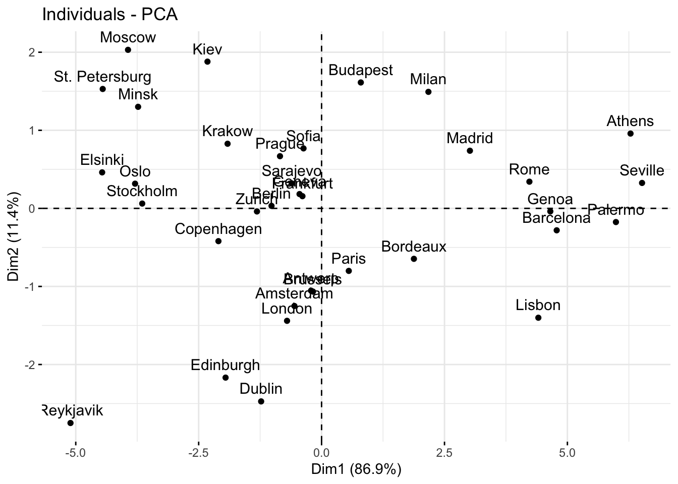
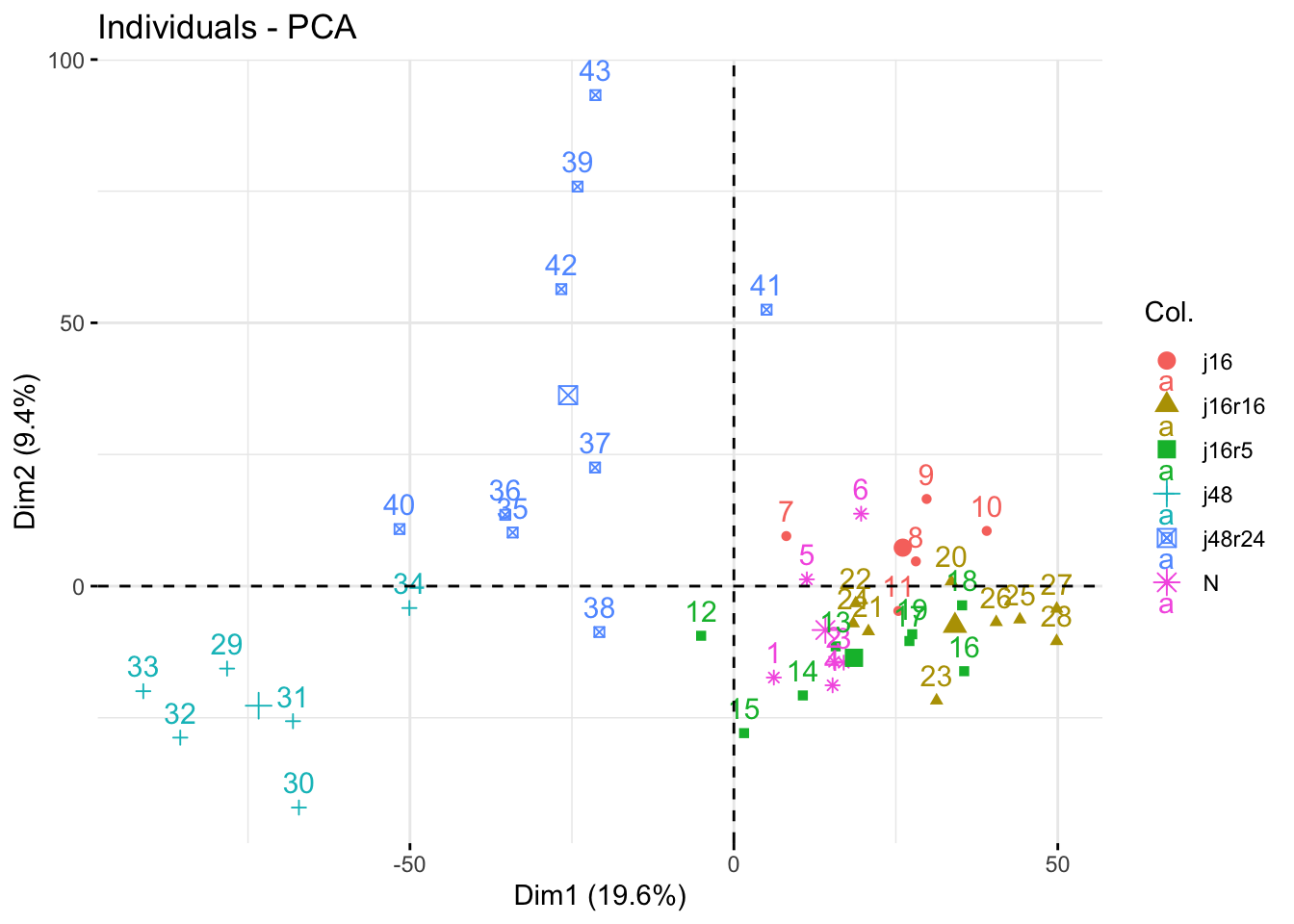
We can use the factoextra::fviz_pca_ind() function to visualize the cities in the plane defined by the first two principal components:
factoextra::fviz_pca_ind(pca_results)
The plane is naturally divided into 4 panels:
The top left panel groups cities with negative scores on the first component but positive scores on the second component reflecting rather low average temperature but relatively high thermal amplitude.
The top right panel groups cities with positive scores on the first component and positive scores on the second component reflecting rather high average temperature and relatively high thermal amplitude.
The bottom left panel groups cities with negative scores on the first component and negative scores on the second component reflecting rather low average temperature and relatively low thermal amplitude.
The bottom right panel groups cities with positive scores on the first component but negative scores on the second component reflecting rather high average temperature but relatively low thermal amplitude.
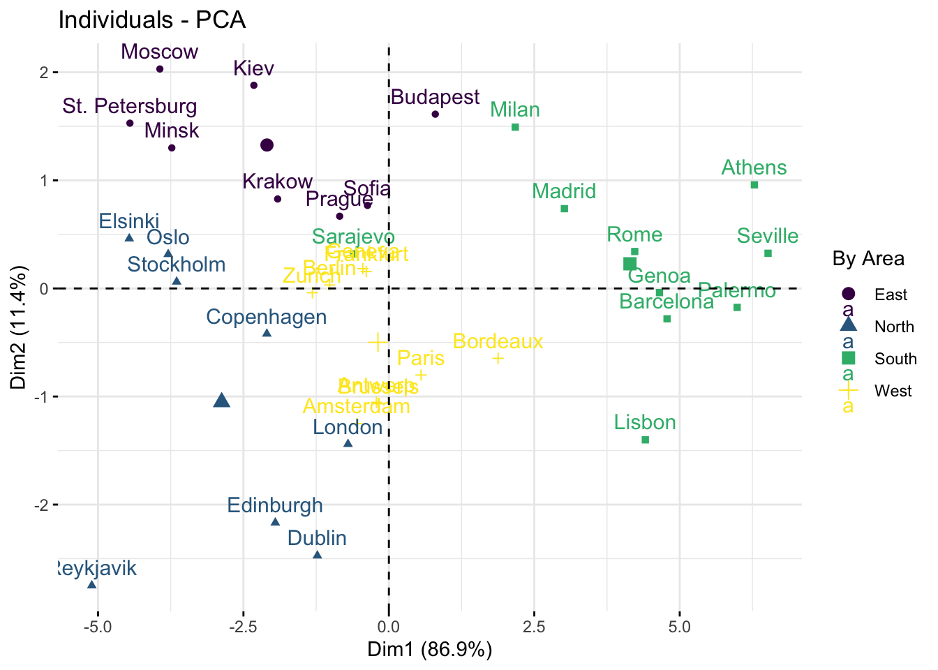
We can also add colors to the plot to see if the area of the cities is correlated with the temperature profiles:
factoextra::fviz_pca_ind( pca_results,col.ind = temperature$Area, # color by groupspalette = viridis::viridis(4),legend.title ="By Area")
This is interesting as it reflects that:
western capitals have a medium average temperature and medium thermal amplitude.
nothern capitals are grouped in the bottom left panel.
eastern capitals are grouped in the top left panel.
southern capitals are grouped on the right side with cities that are therefore globally warm but with some of them featuring a high thermal amplitude like Milan while others featuring a more stable temperature over the year like Lisbon.
Interpretation of units
The fact that some cities have a negative score on the second principal component does not mean that winter achieves higher temperature w.r.t. summer.
Recall that temperatures have been standardized across cities. Hence, if you want to interpret the scores in terms of temperatures, you should do it by hand with something like:
It regroups 43 chickens who went through six different diets:
normal diet (N),
fast for 16h (F16),
fast for 16h and back to normal diet for 5h (F16R5),
fast for 16h and back to normal diet for 16h (F16R16),
fast for 48h (F48),
fast for 48h and back to normal diet for 24h (F48R24).
After each process, chicken underwent gene expression sequencing and 7406 gene expressions were collected.
Can we conclude that genes express differently according to the stress level?
How much time is needed for chicken to go back to normality in terms of gene expression?
Data import & Visualization
A quick glance at the content of the CSV file shows that the delimiter is the semi-colon. We can therefore resort to readr::read_delim() to import the data:
The analysis that we want to do puts the focus on the chicken rather that on genes. However, the raw data records genes in rows and chicken in columns grouped by diet. We therefore proceed with some data manipulation to get the data set with 43 rows corresponding to chickens. First, we use tidyr::pivot_longer() to have all variables expect gene become the values of a unique column coined name and the corresponding values in the table for these variables in a unique column coined value:
It is difficult to provide insightful visualization in the original space of variables which is of dimension 7406. We therefore begin with performing PCA and then we will provide hopefully insightful visualizations in reduced space.
PCA
First, we select the numerical variables on which we want to perform the PCA and we standardize them:
The elbow method applied to the screeplot suggests to keep either 1, 6, 8 or 16 components. We can look at the cumulative percentage of variance explained:
In this case, we see that keeping 6 components retains only 50% of the inertia, keeping 8 components makes it up almost to 60% and going for 16 components makes us above the 75% of inertia.
If we use the rule that pertains to keeping all components with an explained variance above 1, then we would keep 42 components.
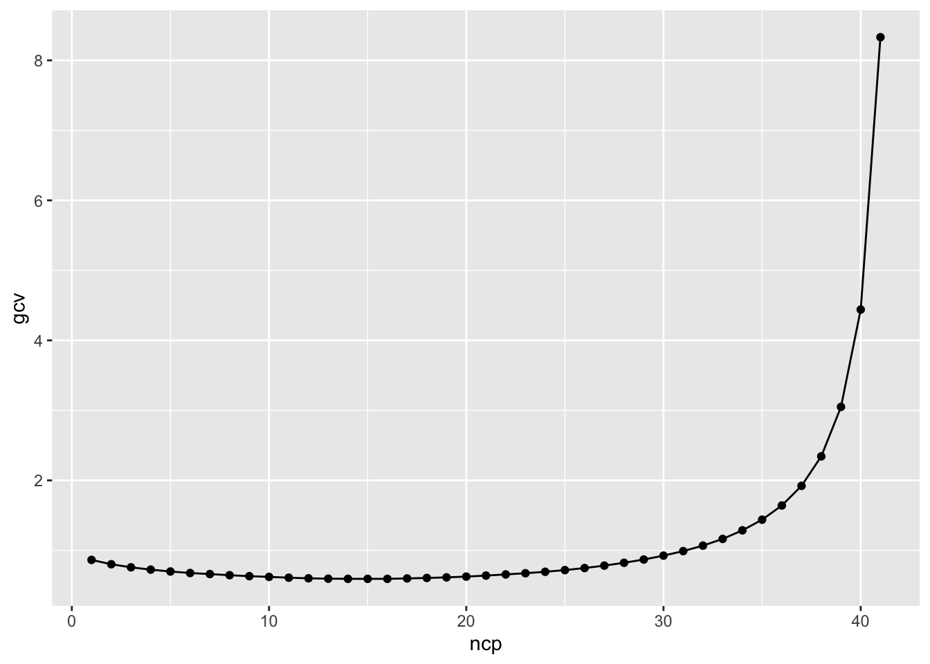
Finally, we can get an estimate of the optimal number of components to keep by minimizing the generalized cross-validation score optained as the mean reconstruction error of each chicken gene expression from the reconstructed gene expression using outputs of a PCA computed on all chickens expect that one. The function FactoMineR::estim_ncp() does exactly that for us:
out <- FactoMineR::estim_ncp(X, ncp.min =1, ncp.max =42)tibble::tibble(gcv = out$criterion, ncp =seq_along(gcv)) |>ggplot(aes(x = ncp, y = gcv)) +geom_point() +geom_line()
out$ncp
[1] 15
Analysis of the variables
The analysis of variables by means of visualizations or tables becomes tricky as the number of variables grows. Typically here, drawing the correlation circle with 7406 arrows would not be of any help. That’s why the factoextra::fviz_pca_var() comes with an optional argument select.var which instruct the function to visualize only the variables that satisfy some constraints. For example, in the code below, we ask it to retain only variables with a cumulated cos2 value in the first principal plane above 0.8. This allows to visualize only those variables which are well represented in that plane:
This is interesting as it shows that, in this plane, only chicken who underwent fast for 48h did not go back to normal gene expression, including those who had been back to normal diet for 24h after the fast.
The limit of linear projections
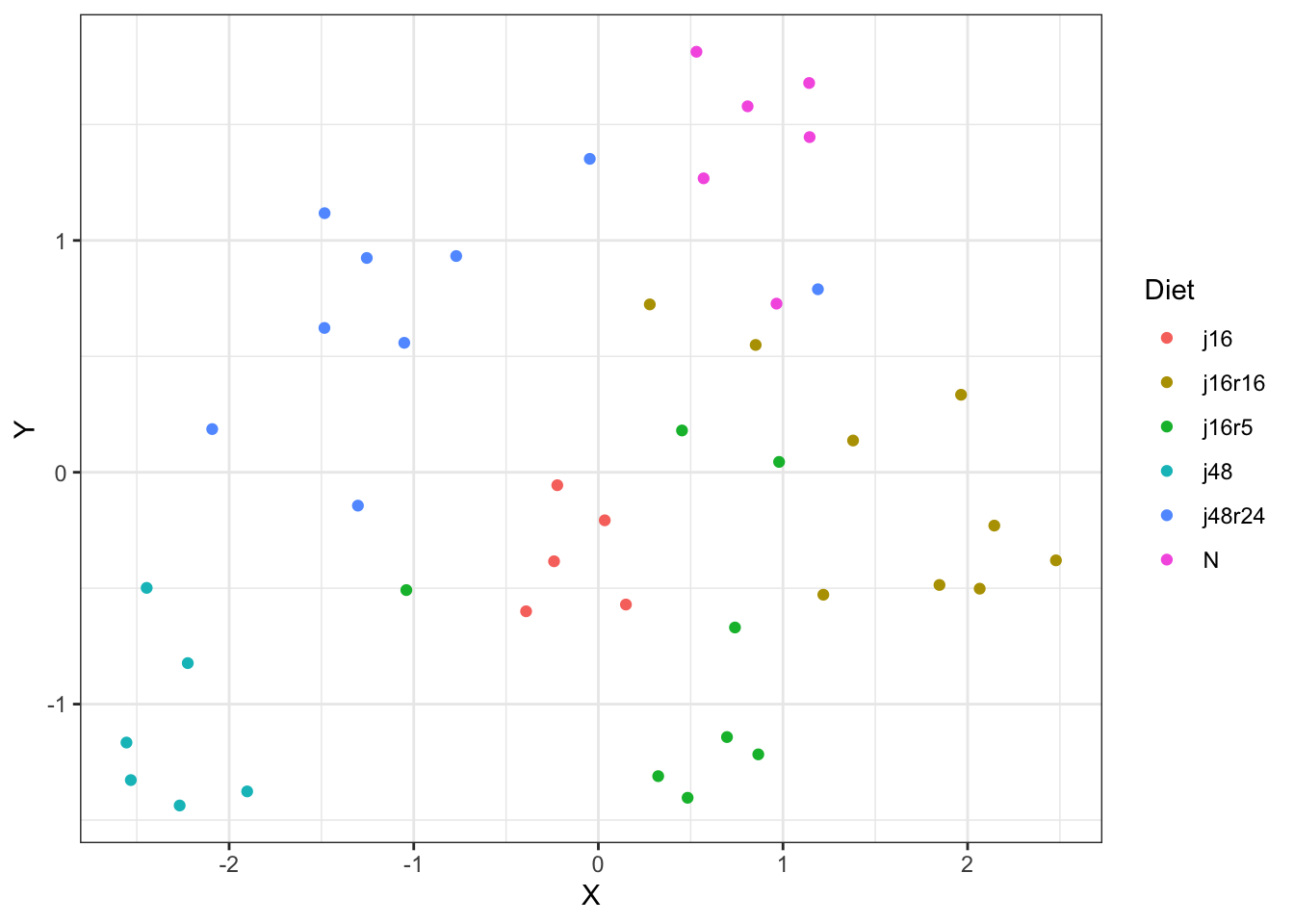
One has to be careful in the interpretation in such cases. Indeed, we could be tempted to conclude that chicken in all the other types of diet went back to normal gene expression. But we are in fact only looking at the chicken in a reduced space that only accounts for less than 30% of the total inertia in the original data! This is what urged researchers typically in the field of genetics to resort to non-linear methods for dimensional reduction such as tSNE or UMAP, which effectively achieve very small reduced spaces in terms of dimension while retaining most of the original inertia. For instance, the code below illustrate the projection of the data in a reduced space of dimension 2 via UMAP:
umap_res <- chk |> dplyr::select(-diet, -id) |>scale() |> umap::umap()tibble::tibble(X = umap_res$layout[, 1], Y = umap_res$layout[, 2], Diet = chk$diet) |>ggplot(aes(x = X, y = Y, color = Diet)) +geom_point() +theme_bw()
This clearly illustrates that claiming that chicken who underwent fast for less than 48h go back to normal gene expression on the basis of the results from the PCA would have been completely misleading.
Le jeu de données orange.csv
Six jus d’orange de fabriquants différents ont évalués. Toutes les variables sont-elles indisensables ? Y a-t-il des jus qui se dégagent comme particulièrement bons? mauvais ?
Rows: 6 Columns: 17
── Column specification ────────────────────────────────────────────────────────
Delimiter: ";"
chr  (3): Product, Way of preserving, Origin
dbl (14): Odour intensity, Odour typicality, Pulpiness, Intensity of taste, ...

ℹ Use `spec()` to retrieve the full column specification for this data.
ℹ Specify the column types or set `show_col_types = FALSE` to quiet this message.