In the following exercises, you will be asked to study the relationship of a continuous response variable and one or more predictors. In doing so, remember to:
perform model diagnosis
including visualization tools
including multicollinearity assessment
perform informed model selection
comment each result of an analysis you run with R
Exercise 1
Analysis of the production data set which is composed of the following variables:
Variable name
Description
x
Number of produced pieces
y
Production cost
Study the relationship between x and y.
Solution
The first thing to do is to inspect a very brief summary of the data mainly to get an idea of
the sample size;
the presence of missing values;
the number of categorical and continuous variables.
The skimr package proposes the skim() function that can fit this purpose:
skimr::skim(production)
Data summary
Name
production
Number of rows
10
Number of columns
2
_______________________
Column type frequency:
numeric
2
________________________
Group variables
None
Variable type: numeric
skim_variable
n_missing
complete_rate
mean
sd
p0
p25
p50
p75
p100
hist
x
0
1
1702.8
671.30
852
1213.50
1534.0
2161.25
3050
▇▃▂▃▂
y
0
1
18806.3
5693.01
11314
14839.75
16860.5
23158.75
29349
▇▇▁▇▂
We do not have missing values but only 10 observations.
Next, we can visualize the variation of y in terms of x to get an idea about the kind of relationship that we should model, should there be any:
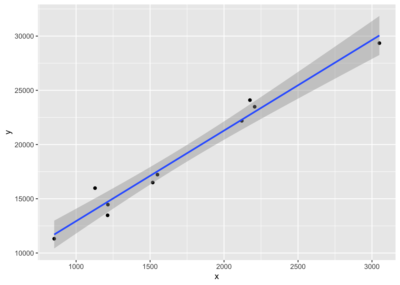
production |>ggplot(aes(x, y)) +geom_point() +geom_smooth(method ="lm")
`geom_smooth()` using formula = 'y ~ x'
The graph suggests that a linear relationship seems to hold.
Now, we can get to the modeling part:
mod <-lm(y ~ x, data = production)dt_glance(mod)
The model exhibits an adjusted \(R^2\) of 0.9657089 which is very high, meaning that most of the variability in y is explained by the modeled relationship with x. Moreover, the p-value of the test of significance of the regression is 2.39^{-7} which is very low, suggesting that the model is statistically significant.
dt_tidy(mod)
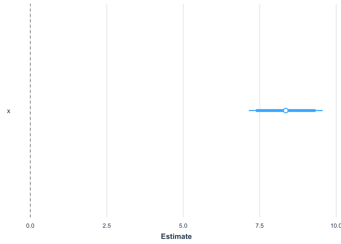
Looking at the table of estimated coefficients, we read a coefficient of 8.3503139 for the predictor x which means that a positive correlation exists between x and y: an increase of x implies an increase of y. Moreover, the p-value of the significance of that coefficient is 2.39^{-7} which is very low, meaning that the coefficient is statistically different from zero, proving that x does have a significant impact on y.
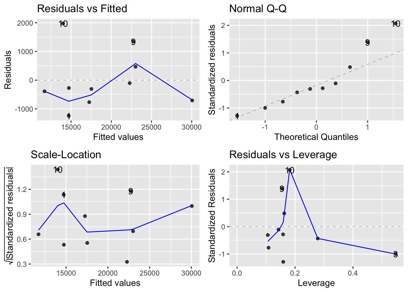
All these conclusions will be only valid if the estimated model satisfies the assumptions behind the simple linear regression. We can plot a number of diagnosis plot to help us investigate this:
library(ggfortify)ggplot2::autoplot(mod)
The Residuals vs Fitted plot does show some structure while we ideally want to see no pattern. This is to be mitigated with the low sample size and the presence of one or two visible outliers (obs. 9 and 10) which seem to drive the visible pattern. These two observations have high residuals and great departure from normality which means that they tend to be outliers. However, the Residuals vs Leverage plot reveals that they have little influence on the estimated coefficients. Hence, overall, we cannot say that the estimated model violates critical assumptions and the previous conclusions drawn from it are valid.
At this point, we can generated a publication-ready summary table of the model:
jtools::summ(mod)
Observations
10
Dependent variable
y
Type
OLS linear regression
F(1,8)
254.46
R²
0.97
Adj. R²
0.97
Est.
S.E.
t val.
p
(Intercept)
4587.39
951.67
4.82
0.00
x
8.35
0.52
15.95
0.00
Standard errors: OLS
We can also provide a nice visualization of the estimated coefficients along with the incertainty about their estimation in the form of confidence intervals:
jtools::plot_summs(mod, inner_ci_level =0.90)
Exercise 2
Analysis of the brain data set which is composed of the following variables:
Variable name
Description
body_weight
Body weight in kg
brain_weight
Brain weight in kg
Study the relationship between body and brain weights, to establish how the variable brain_weight changes with the variable body_weight.
Solution
The first thing to do is to inspect a very brief summary of the data mainly to get an idea of
the sample size;
the presence of missing values;
the number of categorical and continuous variables.
The skimr package proposes the skim() function that can fit this purpose:
skimr::skim(brain)
Data summary
Name
brain
Number of rows
62
Number of columns
2
_______________________
Column type frequency:
numeric
2
________________________
Group variables
None
Variable type: numeric
skim_variable
n_missing
complete_rate
mean
sd
p0
p25
p50
p75
p100
hist
body_weight
0
1
198.79
899.18
0.00
0.60
3.34
48.2
6654.18
▇▁▁▁▁
brain_weight
0
1
283.14
930.28
0.14
4.25
17.25
166.0
5711.86
▇▁▁▁▁
We do not have missing values and the sample size is \(62\), which is reasonable should we resort to asymptotic results such as the CLT.
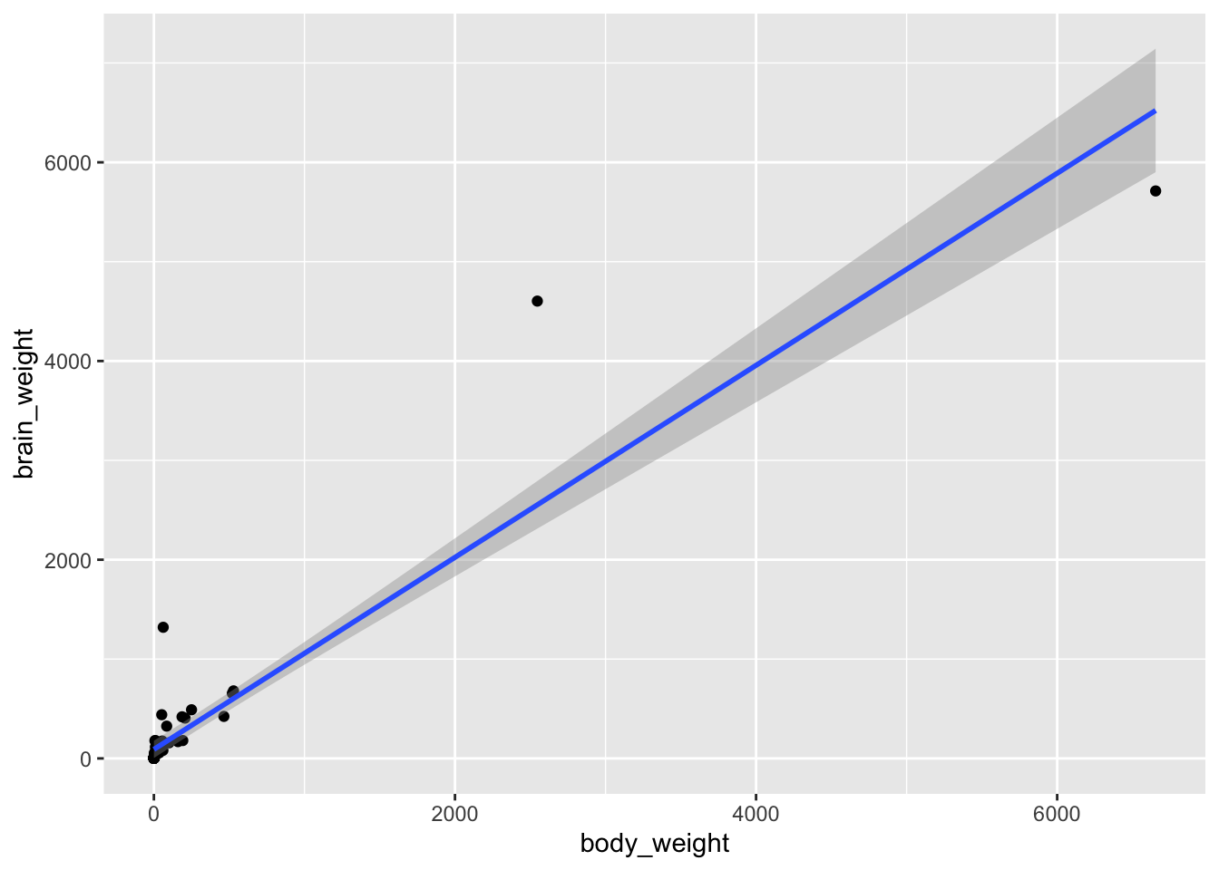
Next, we can visualize the variation of brain_weight in terms of body_weight to get an idea about the kind of relationship that we should model, should there be any:
brain |>ggplot(aes(x = body_weight, y = brain_weight)) +geom_point() +geom_smooth(method ="lm")
`geom_smooth()` using formula = 'y ~ x'
The relationship between brain_weight and body_weight does not seem to be linear. This however does not mean that we cannot use a linear model. Remember that the linear model is called this way because it is linear in the coefficients, not in the predictors!
Here, we observe that
both variables are positive;
most of the mass is concentrated in the bottom-left part of the plot;
the rest of the points seem to follow a logarithm trend.
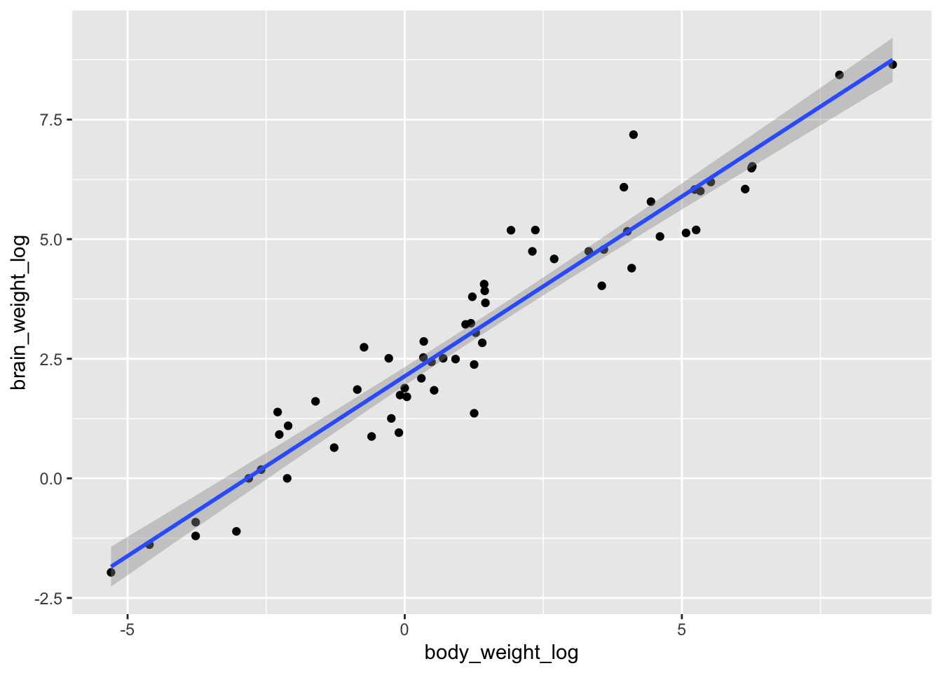
This suggests that a log-log transformation might help. This can be achieved in two ways. One way is actually compute the logarithm of the variables via log() and visualize the newly created variables:
mod <-lm(log(brain_weight) ~log(body_weight), data = brain)dt_glance(mod)
We can now inspect the estimated coefficients and comment the table, carry on model diagnosis and report summary table and CI for estimated coefficients as done in the previous exercise.
Exercise 3
Analysis of the anscombe data set which is composed of the following variables:
Variable name
Description
x1
Predictor to be used for explaining y1
x2
Predictor to be used for explaining y2
x3
Predictor to be used for explaining y3
x4
Predictor to be used for explaining y4
y1
Response to be explained by x1
y2
Response to be explained by x2
y3
Response to be explained by x3
y4
Response to be explained by x4
Study the relationship between each \(y_i\) and the corresponding \(x_i\).
Exercise 4
Analysis of the cement data set, which contains the following variables:
Variable name
Description
aluminium
Percentage of \(\mathrm{Ca}_3 \mathrm{Al}_2 \mathrm{O}_6\)
silicate
Percentage of \(\mathrm{C}_2 \mathrm{S}\)
aluminium_ferrite
Percentage of \(4 \mathrm{CaO} \mathrm{Al}_2 \mathrm{O}_3 \mathrm{Fe}_2 \mathrm{O}_3\)
silicate_bic
Percentage of \(\mathrm{C}_3 \mathrm{S}\)
hardness
Hardness of the cement obtained by mixing the above four components
Study, using a multiple linear regression model, how the variable hardness depends on the four predictors.
Solution
We can take a look at the data summary:
skimr::skim(cement)
Data summary
Name
cement
Number of rows
13
Number of columns
5
_______________________
Column type frequency:
numeric
5
________________________
Group variables
None
Variable type: numeric
skim_variable
n_missing
complete_rate
mean
sd
p0
p25
p50
p75
p100
hist
aluminium
0
1
7.46
5.88
1.0
2.0
7.0
11.0
21.0
▇▃▇▁▂
silicate
0
1
46.62
18.03
16.0
31.0
52.0
56.0
71.0
▃▃▃▇▆
aluminium_ferrite
0
1
11.77
6.41
4.0
8.0
9.0
17.0
23.0
▅▇▂▃▃
silicate_bic
0
1
30.00
16.74
6.0
20.0
26.0
44.0
60.0
▆▇▃▃▃
hardness
0
1
95.42
15.04
72.5
83.8
95.9
109.2
115.9
▆▃▃▃▇
This shows that we have a rather low sample size (13) but no missing values.
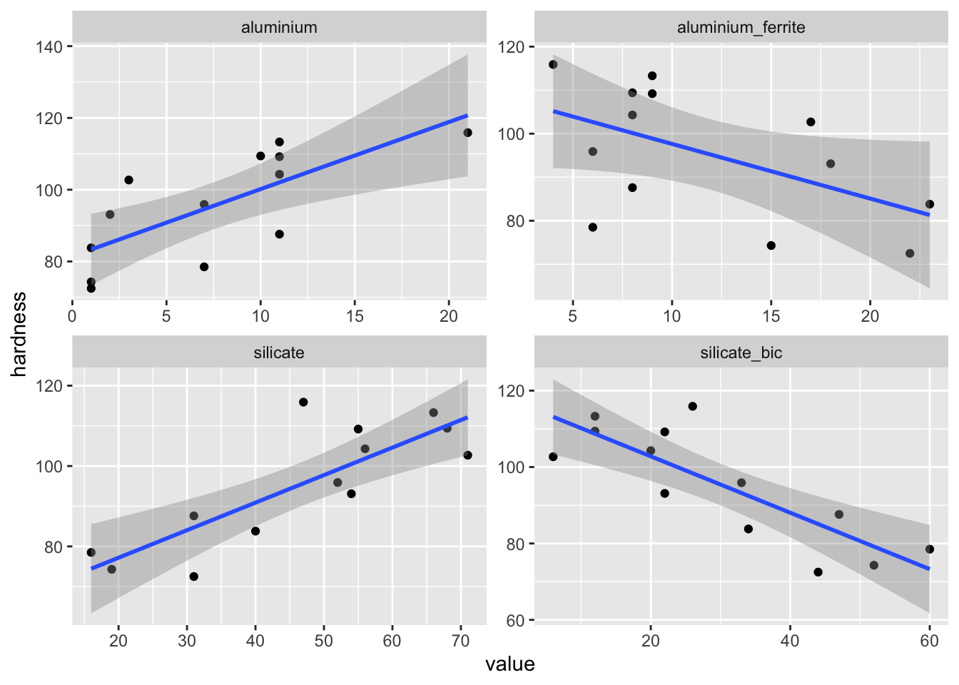
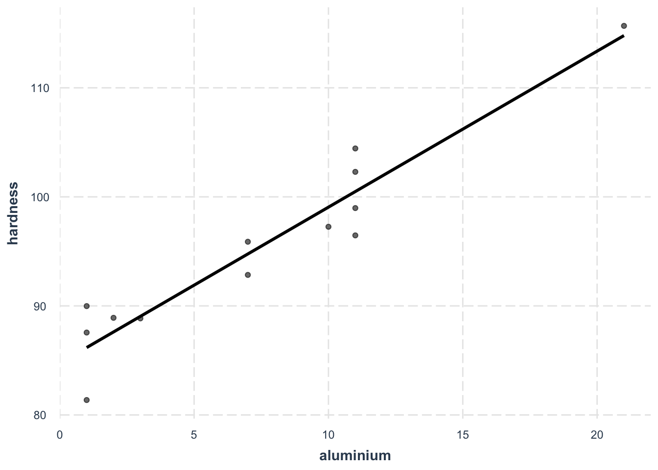
The novelty in this exercise is that we are going to move to multivariate linear regression in the sense that we will have more than one continuous predictor. Here the skim() function reveals that we can use 4 continuous variables to build up predictors. The next thing to do is then to visualize how the variable that we want to predict (hardness) varies with each one of the 4 potential predictors:
For all potential predictors, a linear relationhip with the outcome hardness seems appropriate.
Now, before moving to the modeling part, when it comes to integrating several predictors in a model, it is important to address the problem of collinearity and multicollinearity.
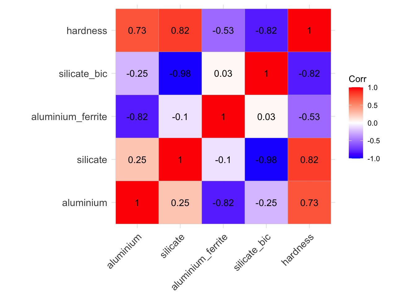
We can look at potential collinearities by visualizing the correlation matrix between variables:
In this matrix, values of correlation very close to 1 are the ones that might create problems by making \(\mathbb{X}^\top \mathbb{X}\) ill-conditioned. Here we notice such a high correlation (-0.98) between silicate and silicate_bic. It might therefore not be a good idea to put them both as predictors in a model.
We can test this assertion by estimating the model with all 4 predictors first and look at the estimated coefficient and corresponding standard error and then do the same thing with a model without, say, silicate_bic.
mod1 <-lm(hardness ~ ., data = cement)dt_tidy(mod1)
mod2 <-lm(hardness ~ . - silicate_bic, data = cement)dt_tidy(mod2)
We observe that:
the coefficient for silicate in model 1 is negative will previous plots suggests that the covariation between hardness and silicate should be positive;
the standard error of this same coefficient is huge in comparison to its value in model 2.
These two observations confirms that we should not include both silicate and silicate_bic in the same model as predictors.
Now we can focus on model 2 and assess whether we now have multicollinearity issues. This can be inspected by computed the VIFs of each predictor:
jtools::summ(mod2, vifs =TRUE)
Observations
13
Dependent variable
hardness
Type
OLS linear regression
F(3,9)
90.25
R²
0.97
Adj. R²
0.96
Est.
S.E.
t val.
p
VIF
(Intercept)
58.83
4.96
11.87
0.00
NA
aluminium
1.40
0.28
4.95
0.00
3.42
silicate
0.57
0.05
10.84
0.00
1.11
aluminium_ferrite
-0.03
0.25
-0.13
0.90
3.24
Standard errors: OLS
Here, all 3 VIFs are relatively small (lower than 5) which suggests that multicollinearity should not be an issue.
Lastly, we can perform a step of model selection by stepwise backward elimination starting with the model with all 3 predictors:
The model selection suggests that, on the basis of the AIC, we can get rid of the aluminium_ferrite predictor as well which seems to have little non-significant influence on hardness.
We have now a good candidate model that we need to inspect, diagnose and report about as done in Exercise 1.
dt_glance(mod3)
# diagnostic
jtools::summ(mod3, vifs =TRUE)
Observations
13
Dependent variable
hardness
Type
OLS linear regression
F(2,10)
150.13
R²
0.97
Adj. R²
0.96
Est.
S.E.
t val.
p
VIF
(Intercept)
58.28
2.42
24.10
0.00
NA
aluminium
1.43
0.15
9.54
0.00
1.07
silicate
0.57
0.05
11.60
0.00
1.07
Standard errors: OLS
jtools::plot_summs(mod3, inner_ci_level =0.90)
In particular, when reporting about the model, we can add effect plots to focus on the effect of each individual predictors while correcting the observed data points to account for the impact of the other predictors:
Analysis of the job data set, which contains the following variables:
Variable name
Description
average_score
Average score obtained by the employee in the test
years_service
Number of years of service
sex
Male or female
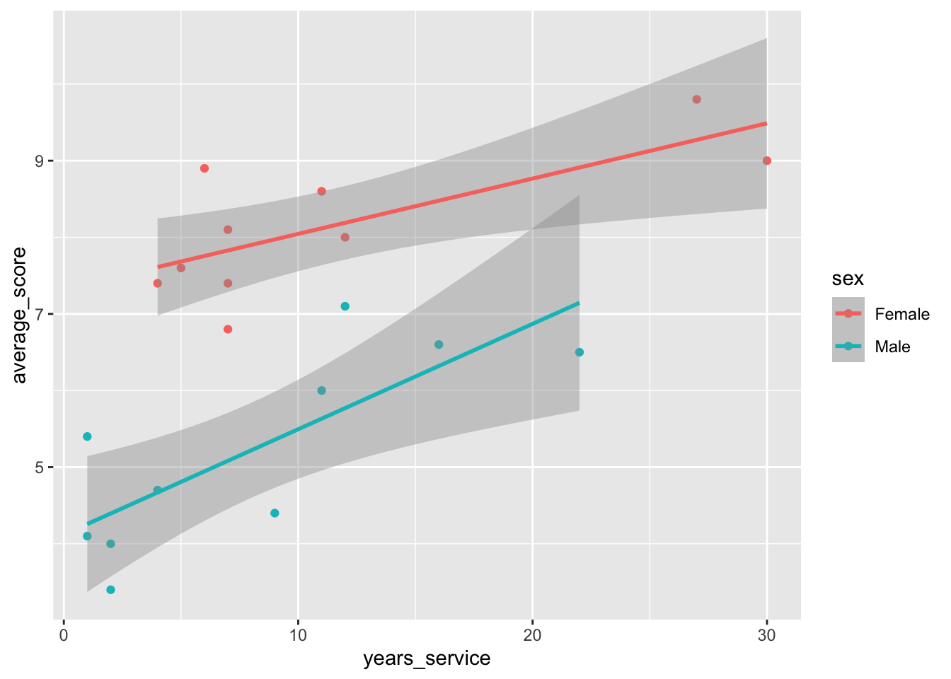
We want to see if it is possible to use the sex of the person in addition to the years of service to predict, with a linear model, the average score obtained in the test. Estimate a linear regression of average_score vs. years_service, considering the categorical variable sex.
skimr::skim(job)
Data summary
Name
job
Number of rows
20
Number of columns
3
_______________________
Column type frequency:
character
1
numeric
2
________________________
Group variables
None
Variable type: character
skim_variable
n_missing
complete_rate
min
max
empty
n_unique
whitespace
sex
0
1
4
6
0
2
0
Variable type: numeric
skim_variable
n_missing
complete_rate
mean
sd
p0
p25
p50
p75
p100
hist
average_score
0
1
6.69
1.86
3.4
5.23
6.95
8.03
9.8
▆▃▇▇▆
years_service
0
1
9.80
8.30
1.0
4.00
7.00
12.00
30.0
▇▇▁▁▂
job |>ggplot(aes(x = years_service, y = average_score, color = sex)) +geom_point() +geom_smooth(method ="lm")
`geom_smooth()` using formula = 'y ~ x'
mod <-lm(average_score ~ years_service * sex, data = job)dt_glance(mod)
dt_tidy(mod)
Model selection by stepwise backward elimination minimizing AIC:
mod2 <-step(mod, direction ="backward")
Start:  AIC=-7.41
average_score ~ years_service * sex

                    Df Sum of Sq     RSS     AIC
<none>                            9.2538 -7.4140
- years_service:sex  1    1.2506 10.5044 -6.8788
It does not suggest to remove the varying slopes. But this is mainly due to the small sample size because AIC is known to be biased in these cases. One could use the corrected AIC: